When I started PaperLark Studio back in 2012, I offered mainly baby shower and kids' birthday party invitations. Up until recently, my logo reflected this with a child-like, fun font with my yellow bird perched atop the letters. Here's an example:
 |
| Logo circa late 2013 - early 2014 |
Last year, I began introducing more products that strayed away from my original child-centered focus. I expanded beyond only paper products to include fabric goods. My business was growing exactly like I had wanted it to and I quickly realized I was outgrowing my logo {and subsequent branding} as well.
One of the many goals I had this year was introduce a more "grown up" logo and brand to better fit my new customer base and style. I'm still in the {slow} process of converting everything over, but I'd like to think I have a pretty solid start going now. For those of you who are developing a logo and brand or for those who are in the same boat as I was, here's a run down of how I tackled my major brand makeover!
IDENTIFY ELEMENTS CENTRAL TO YOUR BRAND. Because I have some loyal customers and social media followers, I didn't want to go a totally new direction to the point where they wouldn't recognize the logo or business. Strong brands have elements that immediately pop into your head when you hear them - like logo shape, color, wording, etc.
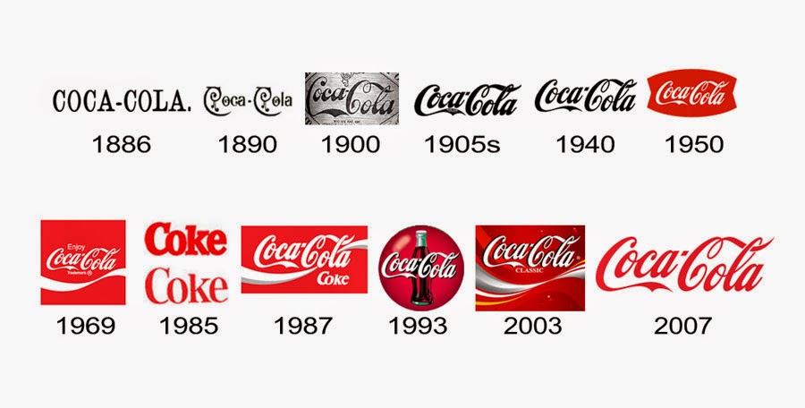
For a prime example, look at this graphic of the evolution of the Coca-Cola logo over the span of their operation. The key elements they pulled out and have consistently used are the fancy font and trademark red. You want to do the same with your new logo and branding.
 |
| Courtesy of Logo-Kid.com |
CONCENTRATE ON YOUR BRAND AND CREATE LOGOS. As my business has grown, so have my core business values and style. Because I've done a pretty significant shift toward hand lettered designs, I decided a hand lettered font would be good fit to convey what my business was all about. I also hunting for a logo design that was a little more grown up, but still fun. Without further adieu, here is PaperLark Studio's new logo:
I'm pretty much in love with it and I should be as much as I stressed over it. Ha! It's grown up, but still a little whimsical while paying homage to element of the old.
CREATE A BRAND BOARD. I'm still in the process of creating my brand board, but I have pretty solid basics here I thought I'd share.
Why create a brand board? I don't know about you, but my creative brain can sometimes run array when I think I have a stroke of genius. Brand boards help creative brains like mine focus on a brand's core values and personality at one glance. If my stroke of genius doesn't fit into the board, it goes to the recycle bin.
However, do not confuse your brand board with a style guide. The difference? A style guide is instructions on how to use your brand elements within your business. Brand boards just display all the elements of your brand.
If you'd like to learn further about how to create a brand board, I recommend this excellent post by Elembee which you can find here.
What tips do you have for tackling a brand overhaul?


No comments:
Post a Comment